Tuesday, April 11, 2017

Color Prework

The colors in this photo contribute to the meaning and the mood. This is because of the warm colors used. The red-orange colors create a warm mood as well as contrasting with the plants and pots. This makes the plants pop as well. If the photographer used cool colors rather than warm ones, that would be the tone of the picture. This picture doesn't look edited very much, but if the photographer increased the saturation it would bring out the colors more.

Thursday, April 6, 2017

Project 2: Framing and Composition

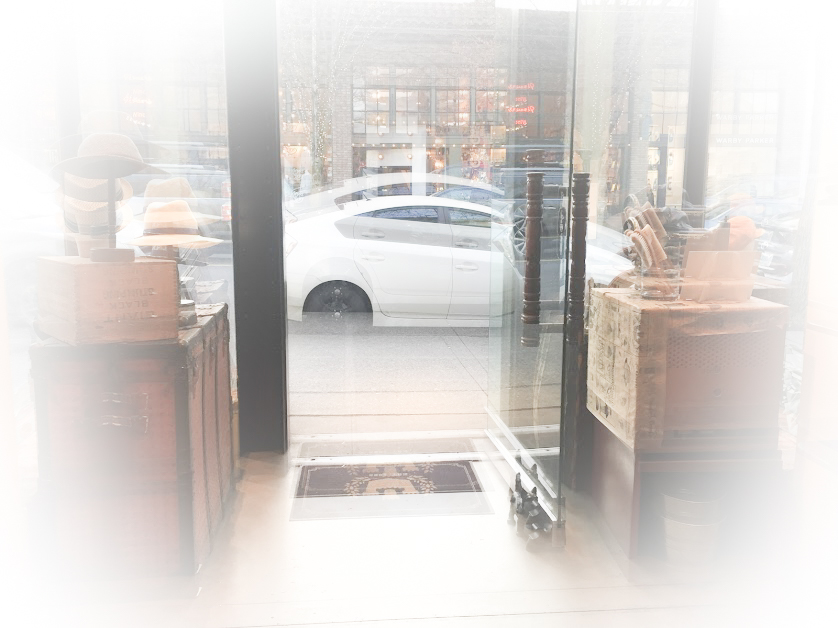
These pictures are for the Framing and Composition project in photography. In this project, we learned different framing and composition techniques as well as editing skills. I took my pictures downtown, on a hike, and in my backyard. Not all of them are edited. I chose some of the pictures I thought stood out from the project. Here they are!
Birds Eye View
Bugs Eye View

Close Up

Diagnols

Fill the Frame

Frame within a Frame

Leading Lines

Rule of Thirds

Wednesday, February 15, 2017

Welcome to my blog!

Hi! Welcome to my Photography class blog! I am a student in a photography class at my school, which this blog is for. I enjoy being with friends, traveling, and photography. On this blog, you will see photos that I have taken for my class and in my free time, photos that I love and am inspired by (that I haven't taken), and other posts about photography. My favorite thing to take pictures of is nature.


Julia Engel


 Julia Engel


Lauren Watt


Lauren Watt


Lauren Watt

Final Portfolio